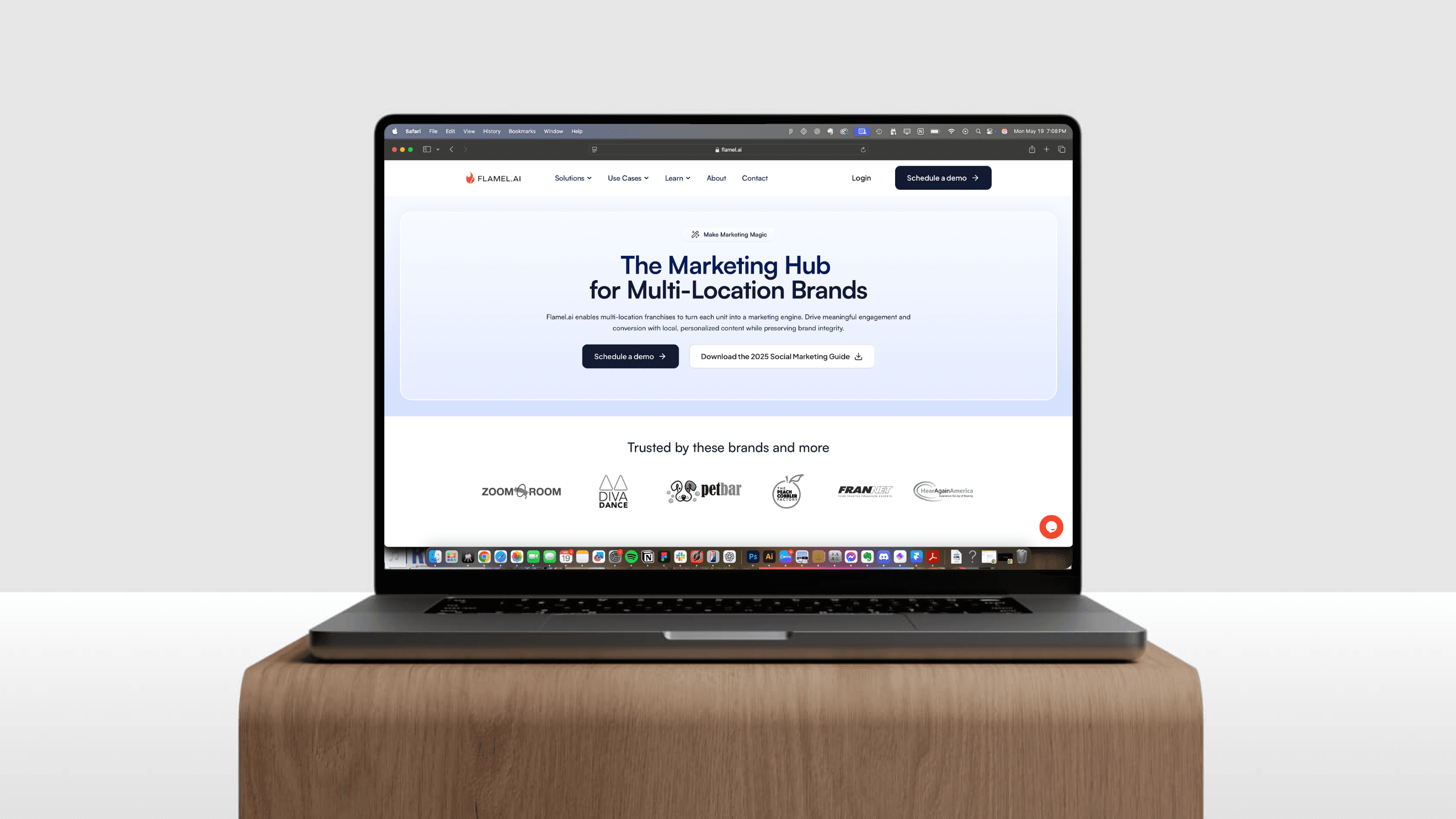
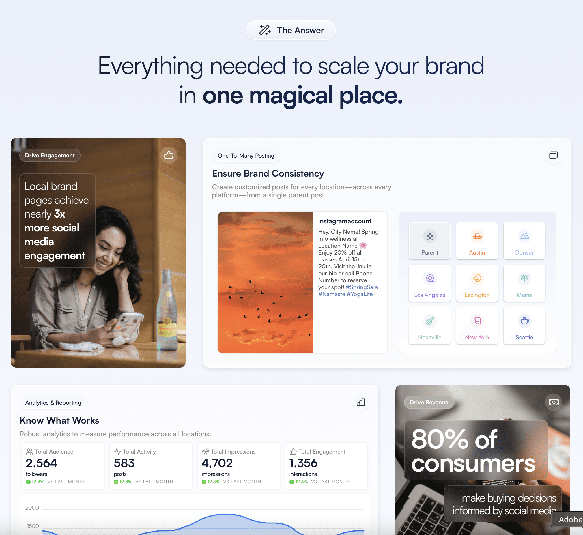
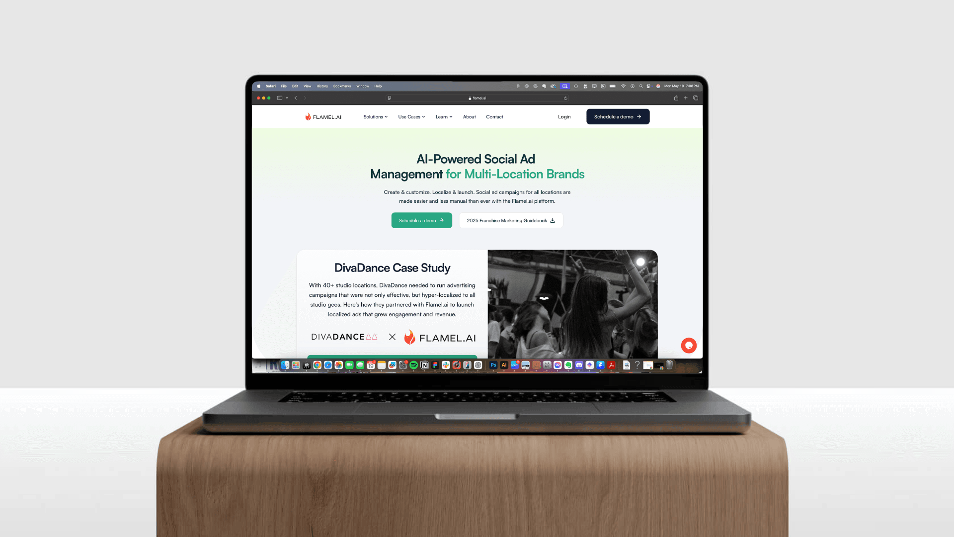
The redesigned site functions as a single, coherent narrative that mirrors the product’s multi‑module architecture while remaining lightweight enough for rapid iteration. The site is composed of reusable components that enforce consistent spacing, typography, and interaction patterns across every view, from high‑level overviews down to granular feature and use case callouts. Content flows from a broad introduction of the platform into progressively more detailed sections, so visitors can either skim for an at‑a‑glance understanding or dive into module‑specific details. Core pages - like the home screen’s quick demo of campaign distribution or the role‑based use‑case sections - emphasize the app's broad value, while supporting pages dive deeper into module specificities and examples. This structure ensures that when new modules or vertical‑specific case studies launch, they can be added as self‑contained sections without disrupting the overall hierarchy.